

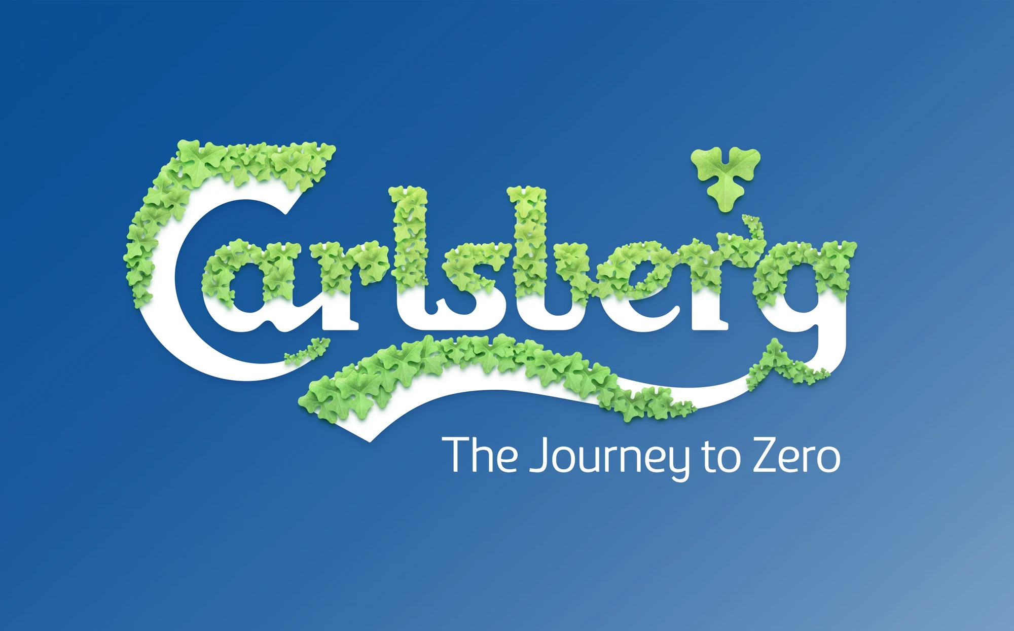
Carlsberg Journey to Zero Branding
The design for Carsberg's Net Carbon Zero campaign uses hundreds of stylised Carlsberg logomarks balanced around the corporate logo as foliage to affirm synergy between Carlsberg and the natural world.
National
MIES Facilities Management
A very crisp rebrand for rapidly-growing compliance company MIES ahead of their multi-million pound acquisition by the Andwis Group.
National

Hyperlight
Name and moody brand for advanced fully automated online metal cutting ordering system Hyperlight.
National
PixelClub™
A bold and distinctive brand build for the innovative website concept PixelClub™ - which aims to take on the budget website market.
Global

Corporate Rebrand for NMCN
A new brand identity for £300M PLC construction giant NMCN
National
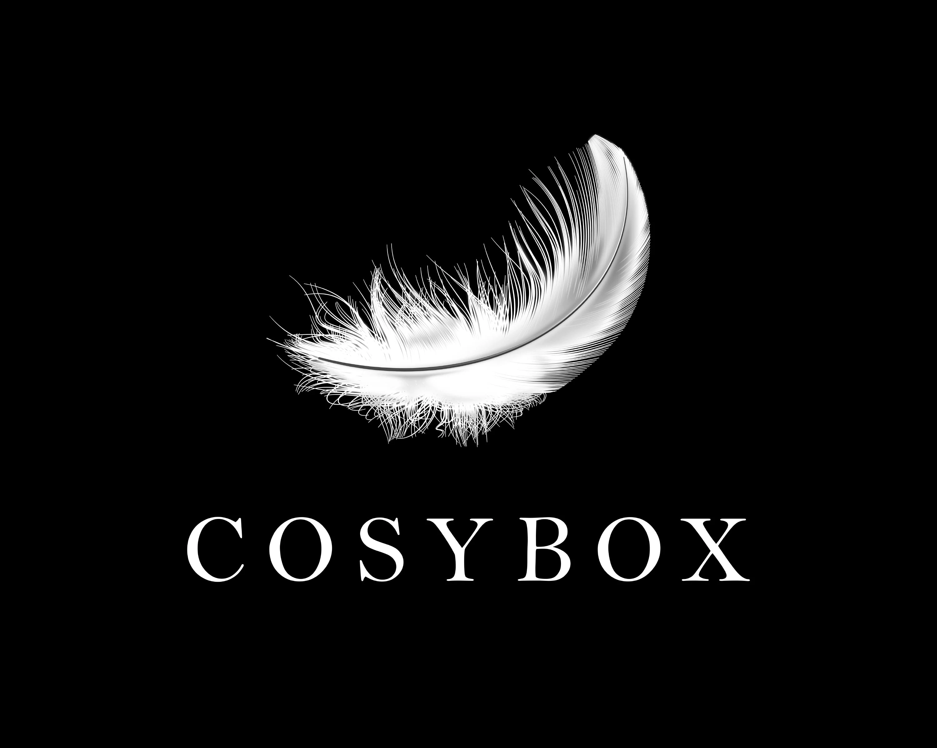
Cosybox Rebrand
Cosybox's final logo features a painstakingly hand-drawn silver feather which took over 9 hours to craft and is a symbol of the firm's uncompromising attitude to interior design
Nottingham
FC7 Construction Rebrand
A bright and deep rebrand for Construction Company FC7
Epperstone
Ward Special Projects Branding
A distinctive new brand identity for £50M Ward's special projects division
National
Vogue Auto Group
A high-end rebrand for prestige car dealership Vogue Auto Group
Sutton-in-Ashfield
NG Fuzion Logo
A street-style logo with attitude for youth music social enterprise NG Fuzion
Nottingham
Fujitsu AA Tournament Logo
Slick identity for the joint charity football tournament
National
AWP - Advanced Wear Parts
AWP is proud to be the official Hardox® Wearparts Centre in the UAE. To be taken seriously as a global metal fabrication service, AWP needed a clean, bold brand developing, including all assets and international stylguide.
UAE
Hermitage Mill Logo
Crafted using Victorian detailing and contemporary typeface this new identity successfully marries Hermitage Mill's Victorian character and modern-day features, just as the high-end renovation will
Mansfield
XO Production Studio Brand Logo
Negative space forces audiences to draw the 'O' that isn't there for XO Digital's film production studio launch
Nottingham
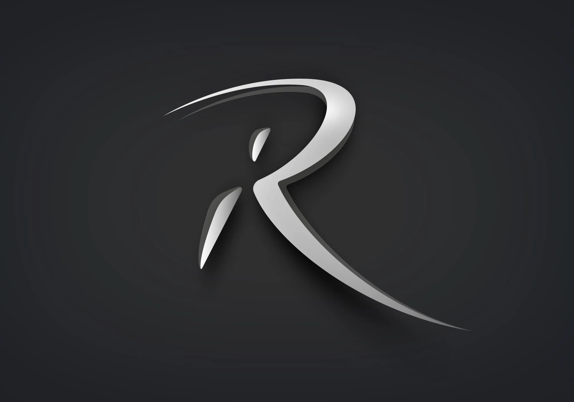
IR Consulting Agency Brand Identity
With a highly refined style & understatement we were able to successfully convey a confident, knowledgable feel that doesn't need to shout for attention to get it.
Nottingham
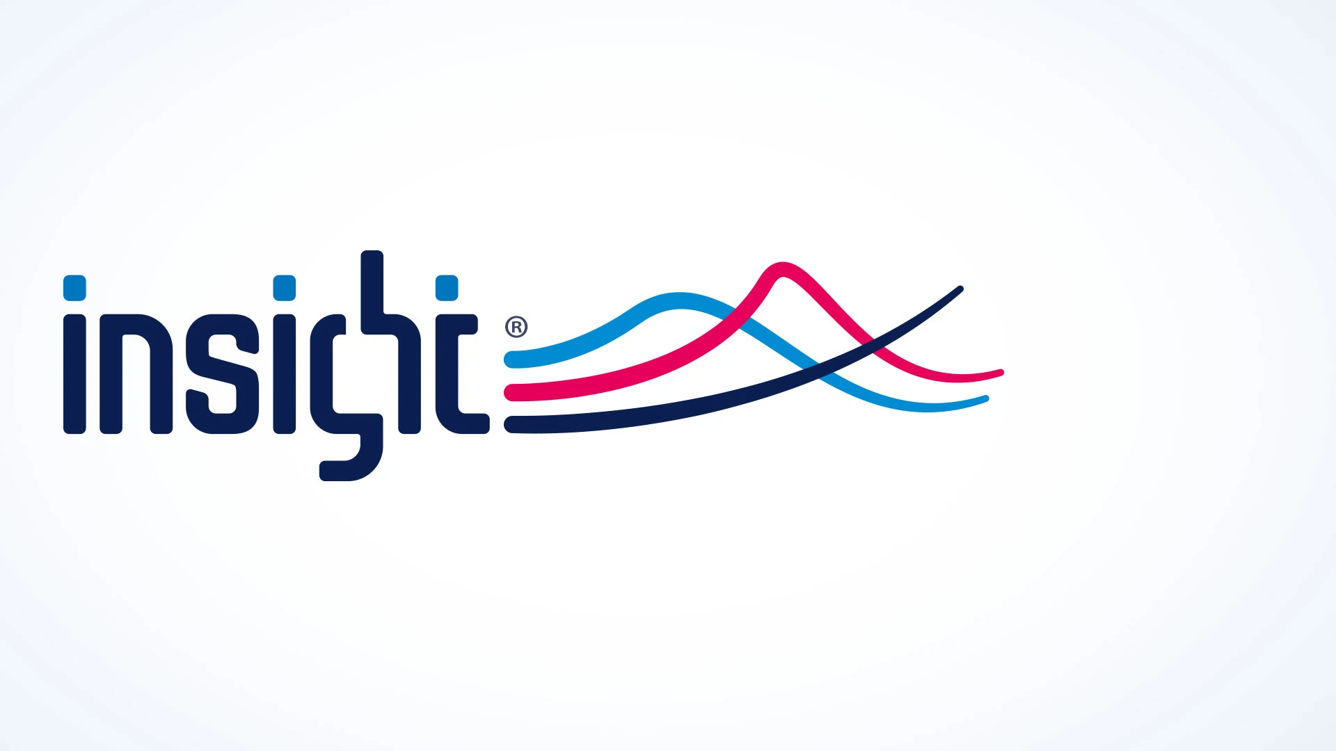
Insight Planning & Analytics Brand Design
Insight's disctictive new brand is a stylised representation of analytics and performance and gives a high end expression of fluidity, nicely contrasting with the strong stature of the font.
Nottingham
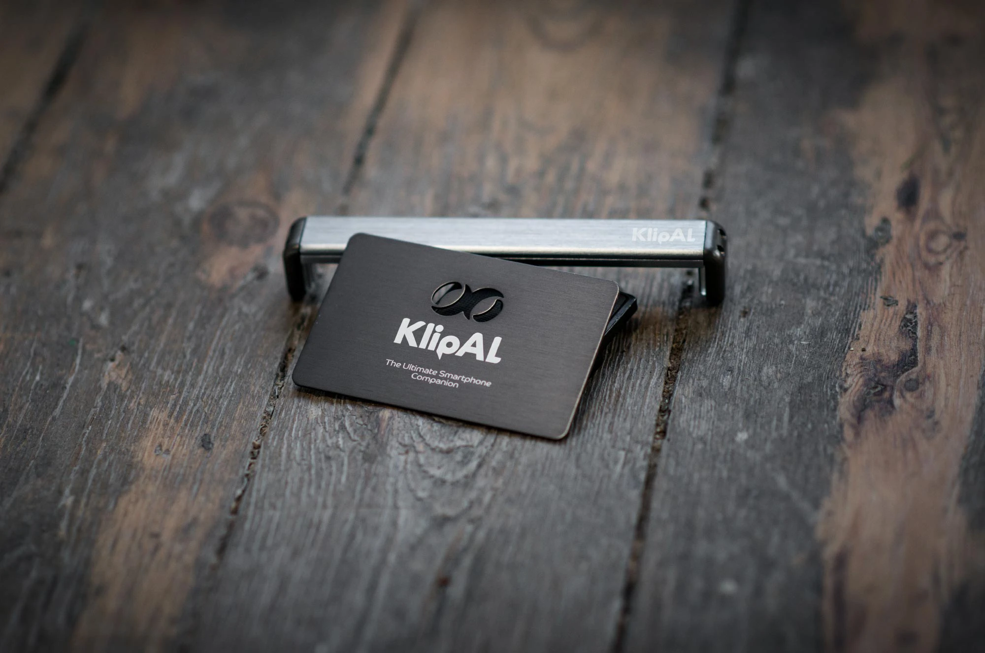
Klipal Product Branding
Smartphone accessory Klipal features branding with twinned rings to create a beautifully simple ambigram. The product itself features a pair of sliding finger rings to significantly aid in the holding and fixing of your smartphone in any position
Nottingham
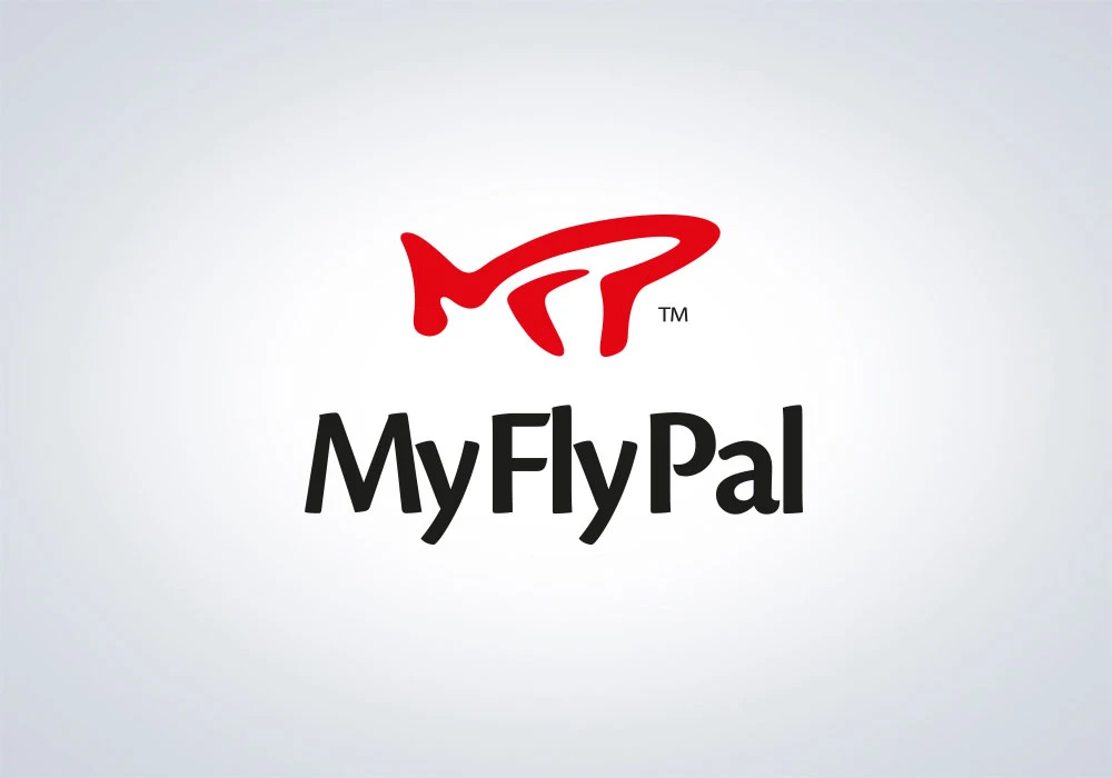
MyFlyPal Branding
Branding with duality for aviation training company MyFlyPal. Some see MFP, some see an aeroplane.
Isle of Man
Lasershape Branding
A confident & identifiable brand for global laser-cutting plant Lasershape, exuding industry, strength & reliability
Nottingham
Nico Nicole Design Branding
A highly confident and perfectly balanced textile-inspired logo and identity for clothing designer Nico Nicole
Nottingham
The Paperless Logo
A beautifully crafted brand for the global paperless initiative
Global

N1 Visual Rebrand
A clean, clever and vivid identity for large-format print house N1 Visual
Nottingham
Tamsin Wheatcroft Corporate Hospitality
An upmarket and personable 'signature' logo for the Tamsin Wheatcroft Agency rollout into Corporate Hospitality and Modelling, which evolves the brand to a more professional and high-end proposition entirely.
National
Tilly Point of Sale Digital Till System
Confident digital product logo for Apollo Digital's digital till system
Cardiff
Cavendish Lettings Rebrand
A new brand for the upmarket Cavendish Lettings, which somehow manages to be understated and vivid in the same expression
Nottingham

EAPI Staff Engagement Sub-Brand for NMCN
Alongside NMCN's major rebrand, this sub-brand was also developed to focus their 1,800 staff on a culture of 'Everyday Actions' that bring 'Positive Impact'
National

Techmax Rebrand
It was important that motorsport racewear manufacturer Techmax's new logo was both simple to embroider and highly recognisable in track paddocks saturated with bright punchy logos
Kirkby-in-Ashfield
YMCA Digital
The digital arts-led youth services sector of YMCA gets a slick new brand with attitude to appeal to it core audience of young people that crave a more creative outlet
Nottingham

Regent Street Clinic Rebrand
An approachable, clean and confident rebrand for high-end national private healthcare clinics Regent Street Clinic
Nottingham
YMCA Main Brand Logo
Rebranded to give a cleaner, more professional impression
Nottingham
Illustration
Beautiful hand-crafted illustrations, often woven directly into the brand identities we build.
Marketing
Promo that promotes - carrying your new brand identity out into the real world.
Vehicle Wraps
Even when it's parked, it's working - your brand identity out on the road, not just on paper.
Product & Packaging Design
Done properly, it floods the mind with anticipation - your brand identity, held in someone's hands.
Brochure Design
Beautifully designed and printed brochures that are simply too good to throw away - a physical extension of your brand.
Recent Creations

Quality Street Lucky Tin
Nestlé

Colne Valley Viaduct Showreel
Align HS2

AAE Corporate Website
Advance Armour Engineering

The Big Build
Keltbray

Tenfold Dungeons
GF9

MIES AGM
MIES Facilities Management
Brand Design Questions, Answered
What's the difference between a logo and a full brand identity?
A logo is one mark. A full brand identity extends that mark into a consistent style across colour, typography, imagery, and every touchpoint your customers see, so your business feels the same wherever they encounter it.
How do I know if my business needs a rebrand?
Common signs include a logo that no longer reflects where your business is now, inconsistent branding across materials, or growth (like acquisition or expansion) that your old identity doesn't represent.
How much does brand design cost?
It depends on scope, from a standalone logo to a full corporate identity system with style guide. Send us your brief and we'll give you a straightforward quote.
What do I get at the end of a branding project?
Typically your logo files in all required formats, a style guide covering colours, typography and usage rules, and any wider assets your business needs, such as brand guidelines for print or digital use.
